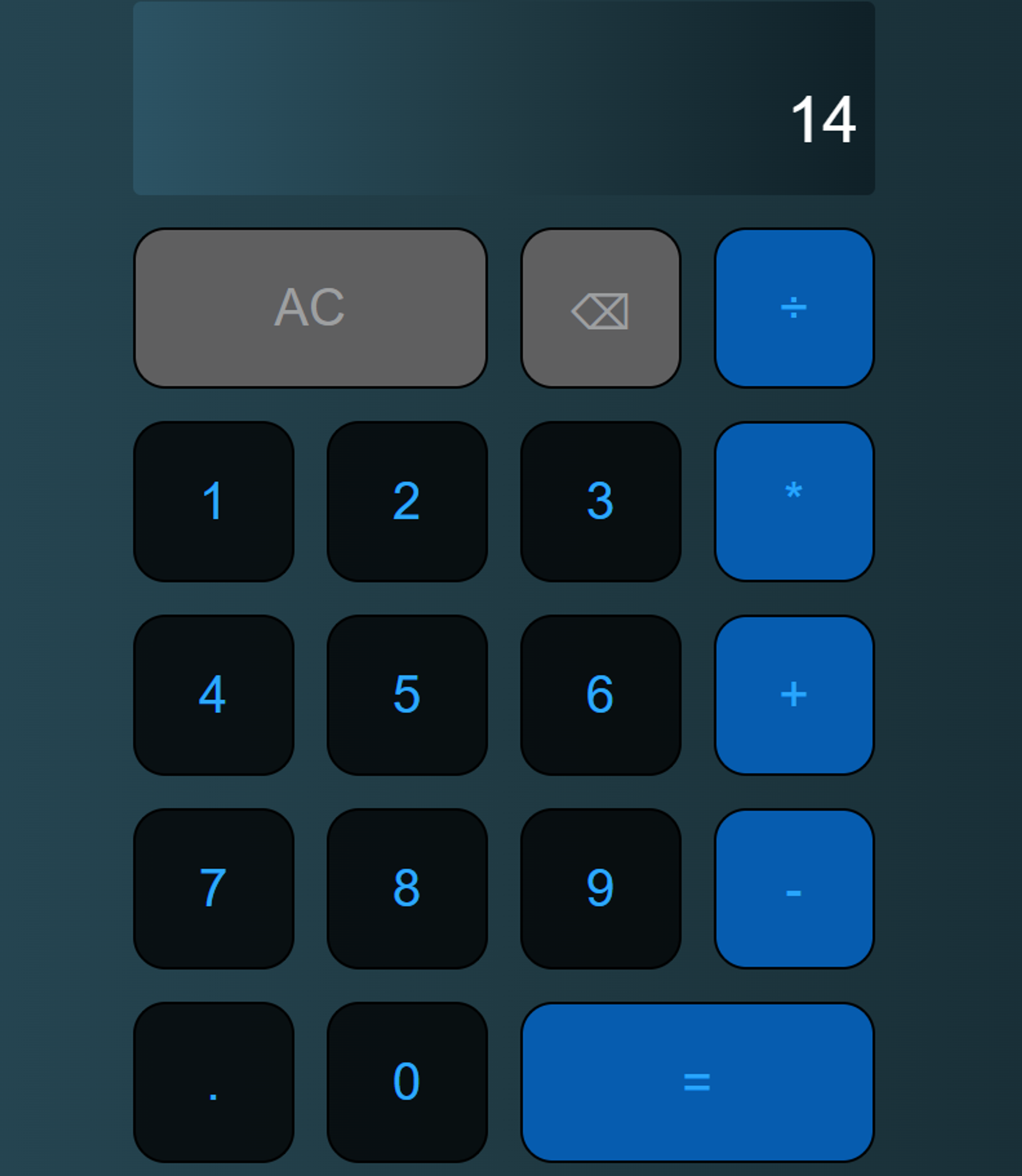
Now, we have a website template, though it’s looking … a bit bland. Experiment with changing the background color and text colors; add animations and color gradients.
For example, you can make the following aesthetic changes:
a. Change the number button background into black, with blue text and a white animation (similar to how our buttons animated with our base code).
b. Make only the operand buttons blue (with blue text, so you have to figure out a good balance between the button background and button text), and make it animate green (Medium spring green to be exact)
c. Next turn the miscellaneous buttons (The All Clear and Backspace buttons) gray (with grey text) and make the button animate dark teal on hover.
d. Then try making a gradience of your choice (Ours was from https://uigradients.com/#MoonlitAsteroid) that compliments your buttons, your output window and the overall look of the website.
After making these changes, your website will look like this:

Of course, you get to decide the colors and transitions.
For the template code, use the html code and the css code for the calculator.